Iraq War Deaths for December 2007 through June 2008
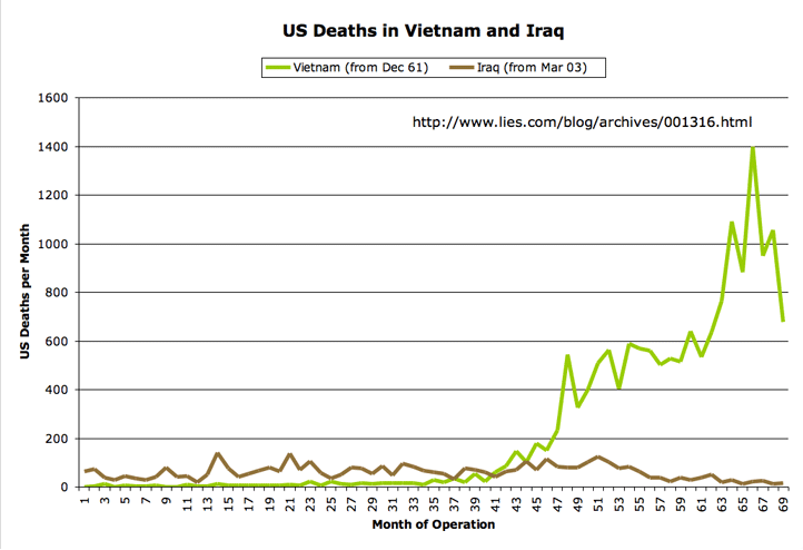
Here are the updated graphs covering the last seven months. US military deaths in Iraq have continued to be fairly low, at least be the standards of the past few years. The highest number of US troop deaths during this interval came in April, with 52 deaths; the lowest number was in May, with 19 deaths. For a less-hopeful graphic, see Kevin Drum’s reposted graph of US casualties in Afghanistan, which shows a steady increase over the last several years.
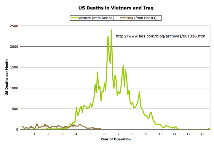
As always, I’m comparing the US military casualties in Iraq to those from the Vietnam war at a similar point in each war’s political lifetime (which some have charged is misleading; see disclaimer below). The data come from the advanced search tool at the Vietnam Veterans Memorial Fund site, and from Lunaville’s page on Iraq coalition casualties. The figures are for the number of US dead per month, without regard to whether the deaths were combat-related.
The first graph shows the comparison for the extent of the Iraq war to-date. (Click on any image for a larger version.)
Next, the chart that gives the US death toll for the entire Vietnam war:
Disclaimer: I’ve been accused of comparing apples to oranges in these graphs. For the record, here’s what I am not arguing:
- I’m not saying that Iraq is somehow deadlier per soldier-on-the-ground than Vietnam. For both wars, the number of fatalities in any given month tracks pretty closely with the number of troops deployed (along with the intensity of the combat operations being conducted). There were more troops in Iraq in the early going than were in Vietnam during the “corresponding” parts of the graphs. Similarly, for later years in Vietnam, when the monthly death toll exceeds the current Iraq numbers, there were many more troops in place.
- I am not saying that Iraq is somehow “worse” than Vietnam. I include the first graph mainly because I wanted a zoomed-in view of the Iraq data. And I include the second graph, which shows the entire span of the Vietnam war, because I want to be clear about what the data show about overall death tolls — where any rational assessment would have to conclude that, at least so far, Iraq has been far less significant (at least in terms of US combat fatalities) than Vietnam.
I was just curious how the “death profile” of the two wars compared, and how those deaths played out in terms of their political impact inside the US. For that reason, I chose as the starting point for each graph the first fatality that a US president acknowledged (belatedly, in the case of the Vietnam graph, since US involvement in the war “began” under Kennedy, but the acknowledgement was made only later by Johnson) as having resulted from the war in question.
As ever, you are free to draw your own conclusions. And for that matter, you’re free to draw your own graphs, if you have a way of presenting the information that you believe would be better. In that case, feel free to post a comment with a URL to your own version. Thanks.

July 8th, 2008 at 10:08 am
Thanks for posting the charts again. I’d like to make three points:
1) I wonder how the casualty charts would look, since clearly we’re much better at saving the lives of injured soldiers than we were back in Vietnam.
2) I wonder if the military strategy has changed as well. I’m going on the assumption that our power over Vietnam was significant enough that the increase in our military power since then is immaterial to having such low death rates. Perhaps there’s a different strategy here in Iraq?
3) I’d also be curious about the civilian casualty figures and if there has been any progress between these two conflicts.
July 8th, 2008 at 2:43 pm
Steve,
In a 2004 Washington post article it said fatalities are about 10 percent in this war, I’ve recently heard 1 in 12 so we have gotten better as the war has progressed, they were about 25 % in Vietnam and the first Gulf war. We are getting much better at getting guys back to the US for treatment, they said it took an average of 28 days in the Vietnam era to get someone home, in one case in this war a soldier was in Walter Reed in 36 hours with about a week being average. The two wars aren’t very analogous in terms of geography, or tactics. This Iraq war is a combination of urban and desert warfare and the Vietnam war was jungle so getting someone out of the fight would be easier in Iraq I would think. We have also had absolute air superiority in Iraq and are fighting a much smaller and less organized force. This war has it’s own unique set of challenges, but the two wars aren’t very similar.
I don’t think anyone has good numbers on civilian losses in either war. I would think civilian losses caused by us would be less with the development of smart bombs. They were in their infancy at the end of Vietnam. I would think civilian losses from the terrorists would be higher in this war if you don’t include deaths in Cambodia and Vietnam after we left. But those are just assumptions based on some rather sketchy estimates.
Just for historical perspective I believe more people died of injuries weeks and months after the fact in the civil war than were killed outright.
July 8th, 2008 at 5:03 pm
I hear whispers in the medical community that we now rush to ship gravely wounded soldier out of Iraq post haste because if they die in Kuwait or Germany they don’t count as an Iraq war casualty… cooking the books yet again. sop
I’d be very interested to see two more colored lines on jbc’s graph: # of wounded for each war. We are saving lives with our much better front line med tech and medevac systems. Too bad the VA funding increases from 2003, 2004, 2005 and 2006 were all opposed by McBush.
July 8th, 2008 at 7:01 pm
Actually I provided those graphs sometime back
July 9th, 2008 at 4:10 am
This is a short piece out the Times of London, from last Sunday, funny how the US press hasn’t reported this, wouldn’t you think it would be front page news? But I guess good news out of Iraq is bad news for Democrats.
http://www.timesonline.co.uk/tol/news/world/iraq/article4276486.ece
July 9th, 2008 at 10:27 am
Well, much as I hate giving your website traffic, or breaking into the tight little clique that frequents here, I thought I’d come back one last time for some closing thoughts.
As always, your protests and rationalizations regarding your motives are really weak. If anyone goes back and reads your original post, it’s quite clear that the purpose of constructing these (otherwise truly excellent) graphs was to advance the claim that Iraq = Vietnam.
As always, I claim your start dates were chosen not because they made any sense, but to ensure that the graph you ended up with supported the thesis you wanted to advance at the moment you made it.
Now that that thesis has been left in tatters by the onward march of history, as I always said that it would be, I want to add a few things:
a) I told you so.
b) If you had adopted the reforms I suggested early on, ironically you would have actually done a better job of fulfilling both your stated and unstated goals. In case you’ve forgotten, the reforms I advocated had three parts.
i) Set the graphs up so the the Vietnam trendline begins when the US first sent advisors to Vietnam and US soldiers began dying, which is significantly prior to where you begin it your graph.
ii) Likewise, set up the Iraq trendline to begin with the December 28, 1992 incident which broke the ceasefire that ended the first Gulf War. This would cover the period of Operation Southern Watch and Operation Desert Fox, a period which, contrary to conventional wisdom the US and the Iraqis were shooting at each other and dying on both sides. As I’ve said before, the most US deaths in a single month during Operation Southern Watch (due to a friendly fire incident) were higher than those of some of the quieter months of Operation Iraqi Freedom. Setting up the graph to show a full picture of the US-Iraqi conflict would show a great deal more historical understanding than you’ve ever shown, but it would be correct.
iii) Align the two trendlines so that the Americanization and escalation of the Vietnam conflict that began with the January 31, 1965 offensive and the March 20, 2003 offensive that marks the beginning of operation Iraqi freedom are the midpoint of the graph. In this way, you’d be comparing apples to apples. The long lead up to both conflicts would be compared to each other, and the period of heaviest fighting would be directly compared to each other.
iv) Normalizing the graph in various ways (time scale, troops engaged) would be interesting, but is not strictly necessary as the above reforms produce a very interesting graph without manipulation.
If you’d actually done those things, the resulting graph would actually show “the “death profile” of the two wars compared, and how those deaths played out in terms of their political impact inside the US.”, and would actually show a good deal of political similarities between the two conflicts. But, since your interest in history was never as acute as your BDS, the actual graph you produced has absolutely no merit and will henseforth only increasingly show just how wrong headed you always were.
July 9th, 2008 at 10:33 am
Celebrim wrote:
‘If you’d actually done those things, the resulting graph would actually show “the “death profile” of the two wars compared, and how those deaths played out in terms of their political impact inside the US.”, and would actually show a good deal of political similarities between the two conflicts. But, since your interest in history was never as acute as your BDS, the actual graph you produced has absolutely no merit and will henseforth only increasingly show just how wrong headed you always were.’
Heh. Well, at least it’s good for _something_.
John
July 9th, 2008 at 10:37 am
“I hear whispers in the medical community that we now rush to ship gravely wounded soldier out of Iraq post haste because if they die in Kuwait or Germany they don’t count as an Iraq war casualty… cooking the books yet again.”
enkidu: That lie has been widely debunked by numerous websites, including by ones that lean hard to the left – probably because itthey don’t want idiots repeating it and poisoning the anti-war well with easily debunked conspiracy theories.
But don’t take my word for it. Try this site with a left leaning admin, http://icasualties.org/oif/Outoftheater.aspx
Anyway, keep up with your stupidity, it just makes it easier for me to discredit the whole bunch of you morons.
July 9th, 2008 at 11:09 am
I think celebrim’s interest in these charts is not as acute as his lies.com derangement syndrome.
July 9th, 2008 at 11:19 am
haven’t you heard? it is spelled morans
images.google.com/images?client=safari&rls=en-us&q=morans&ie=UTF-8&oe=UTF-8&um=1&sa=X&oi=image_result_group&resnum=1&ct=title
The only bush derangement syndrome is for morans who still think shrubbie is in any way competent for the job.
July 9th, 2008 at 6:51 pm
shcb,
Nice article about Al-Qaeda in Iraq. Considering there was no such thing as “Al-Qaeda in Iraq” before America invaded and made it so, you might actually be part way towards returning to where you were in 2003. No wonder American press didn’t cover the story, the implications are depressing and damning for America’s military “accomplishment”.
Once you have driven the remaining 1200 “Al-Qaeda in Iraq” fighters (ever question who made up those numbers,how or why?) away to their deaths or other regions, are you going to return your attention to the insurgency continuing throughout the country or the 80% (my estimate) of Iraqi’s who want American troops to leave?
Next topic: Angry wwnj’s –
I thought Celebrim had some good points, but wow were they ever out of place. Rather than criticize, he should stfu and go create his own graphs.
Funny how, despite his claims that jbc’s method failed and that therefore JBC was ideological and wrongheaded, his assertion that his method would have shown the similarities between the two wars was surprising. That reminds me of a defence attorney (JBC) facing off against an incompetent prosecutor (but who thinks he is cerebral) and the defence attorney just smiles and motions for the prosecutor to please… keep talking(!) knowing that the prosecutor will simply FUBAR his own case and no defence will be necessary.
Kudos to JBC’s reply to Celebrim, I got a chuckle out of it. The sad part is that the wwnj probably took John’s reply seriously. I’m starting to agree with Enk that ridicule is the best way of dealing with these wwnj’s. It seems that trying to be rational, explain subtleties or what constitutes general human decency is completely lost on them. Arguing with these arrogant degenerates is like wrestling with a pig: nothing is accomplished, you both end up covered in shit, and the pig likes it.
July 10th, 2008 at 4:36 am
I’m not sure what brought on that tirade by Celebrim either. I have always thought John’s graph was reasonable. You have to start somewhere; I suppose we could make a graph starting at the crusades. The main thing is to use data that is relevant and stay consistent and I think John has done both. At that time the graph was started the surge was just getting underway and that coincided with an upturn in troop deployment in Vietnam. Now maybe John forced his starting point so the surge and the escalation of Vietnam matched up but that is ok to a point. The most important aspect of this graph is it shows that these two wars aren’t very similar. I’m guessing that if Celebrim were to make his own graphs not much would change, there might be a few bumps here and there that are different but the trends would be the same.
July 10th, 2008 at 7:47 am
shcb – I agree.
Maybe Celebrim is having a hard time adjusting to the pendulum swinging back against right wing extremism. Celebrim need not worry, those on the left are easily fatigued when pushing against right wing extremism and wwnj’s. So the pendulum is not likely to go to far.
Also, I’m noting that Obama is starting to sound more like Dick Cheney lately than anyone on the left, so things might not be so “bad” for Celebrim after all.
July 10th, 2008 at 7:47 am
*too far
August 6th, 2008 at 4:46 pm
A video tour that helps explain why the deaths are down in Iraq (Baghdad.) http://www.youtube.com/watch?v=TTMp-YNaDdg just putting it out there…