The Animated Iraq Coalition Casualties Map
Here’s a very compelling graphical treatment of my favorite depressing data. From Tim Klimowicz of obleek.com: Iraq War Fatalities.
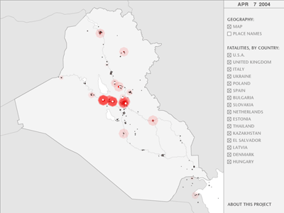
Besides being impressed by the overall presentation of the information, I was also impressed by the following sentiment expressed on the “about” screen:
Although I originally set out to create something as objective and apolitical as I possibly can, this project has raised a few questions in my mind concerning the government’s role in controlling information during wartime, and how that might sway the public’s perception of reality. In addition, it also made me question the notion of objectivity itself, as I found myself having to omit so much information, both voluntarily and involuntarily, in the process of creating this. Though my intent was to be objective, how objective can it really be when something as profound as a human death — which, in itself can have infinite interpretations — is represented with little more than a tiny black dot on a computer monitor? In the end, I suppose, my goal to encompass the entire war in a single animation instead ended up showing just a tiny sliver of the much larger reality — an unavoidable attribute inherent to all forms of communication, even those that are meant to be “objective”.
