Pelosi’s Job Loss Graph vs. Justin Fox’s
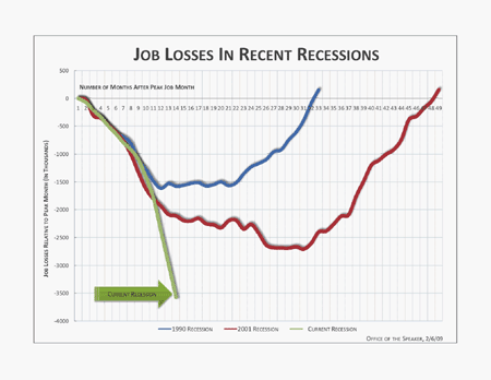
Maybe you saw this chart Nancy Pelosi has been flogging to the media?
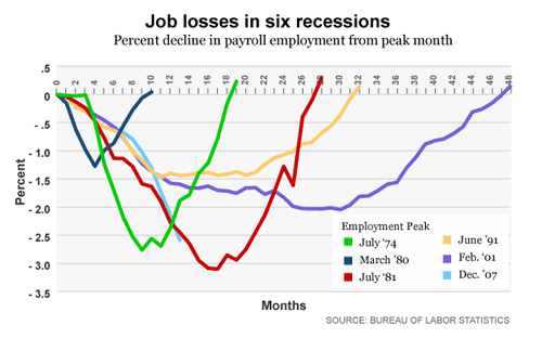
Justin Fox made a more-honest version of it, doing the comparison in percentage terms and including the three previous recessions:
It’s a good example of how it’s possible to be completely dishonest without actually lying, at least from a technical standpoint. Pelosi’s graph is accurate as far as it goes. It uses real numbers. But it’s clear, when you compare it to Fox’s graph, that Pelosi’s was crafted for maximum emotional effect. “Oh my God!” one says when looking at Pelosi’s graph. “Employment is crashing with no end in sight! Who can save us?”
Fox’s graph makes it clear that yeah, employment is thoroughly befucked, and could well be heading for Great Depression territory. But it hasn’t quite outstripped the worst dip in the last 30 years. At least, not yet.
One of those graphs is conducive to fostering rational thought about where we’re at, historically speaking, and what our options might be. The other is conducive to stampeding people in the particular direction favored by the Speaker’s office this week.
We’re not going to get out of this by stampeding. We’re going to get out of it (if we are going to get out of it) through the application of rational thought.
Way to lead, Madame Speaker.
Update: More versions of the graph, with additional recessions, from calculatedriskblog.com: Job losses during recessions.


February 10th, 2009 at 6:38 am
jbc, at least we’re answering the question of whether or not this site is partisan. Let’s hope the cumulative pressure of all this up-speaking will eventually some day influence the Democratic party into being better.
February 10th, 2009 at 8:54 am
Just imagine how much more popular the Democratic Party would be without Pelosi. She’s just too far to the left. As soon as she is replaced as SOTH, the Republican Party slides further into obscurity.
They should get moving on this.
February 10th, 2009 at 9:44 am
no offense, but faulting the chart maker for leaving out info that would not reinforce the message (which to my mind is: omfg!) isn’t a huge lie. A sin of omission perhaps. Did they change any of the data? no. the numbers seem to be accurate. The last two recessions are accurately portrayed. Should we fault Fox’s chart because he changed the y axis to %? Justin Fox flattening the chart somewhat (ie slopes not so steep etc)
You want the other trend lines so that we can be more accurate? fine, more data = more accurate picture
Can I ask what the vector of change is right now? are job losses accelerating or decelerating? how does this compare to the Great Depression? The crash of 1857? can we see the Clinton job boom #s? what? you can’t answer those questions? well then your charts aren’t accurate enough etc etc. It will be interesting to see these two graphs in 3 months, then 6, then a year.
I don’t think ‘completely dishonest’ is completely accurate jbc.
your mileage obviously differs
But by all means let us keep quibbling about the details while Rome burns.
I am enjoying the fiddle music so!
February 10th, 2009 at 3:24 pm
Pelosi isn’t too far to the left, she’s too far to the mindless-partisan-hack.
February 10th, 2009 at 3:37 pm
Ladies & Gentlemen,
Yes, that was quite a show. Now, please return to your seats because that was just the warm up act.
The REAL show is about to begin. Fasten your seat belts and do not look down. This is not like any show you have seen before: this time the bottom is not in sight. You will know it when you hit it.
Thank you for your support and for signing the liability waivers upon entry.
February 10th, 2009 at 3:53 pm
fyi, I DLd those two graphs and overlaid the two. Justin’s graf uses a not-so-subtle-distortion of the Y axis numbers to ‘flatten’ the data and make things look less threatening. If I were to match the 01 curves, I would have to scale Justin’s data to 165% in the Y axis (only). Interestingly, the 91 data would only need about 146% to match Nancy’s graf.
Both charts are telling a story, they are just different stories. Both ‘distort’ the information to make their case. I like having all of Justin’s datapoints/lines to compare, but he massively undermines his case by distorting the Y axis to make things look better. I sent some pics to jbc and considered animating them so we can compare apples to apples (which is definitely NOT the case right now).
And yeah, we haven’t come anywhere close to the bottom yet. It will be years before we can undo the bush era failures.
February 10th, 2009 at 8:24 pm
I assume from the labeling that Fox is distorting the Y-axis only in the sense that he’s making it reflect percentage job loss, rather than absolute numbers. That seems like the right choice to me, if what we’re trying to do is to compare the relatively impact on the labor force of the different recessions.
February 11th, 2009 at 8:05 am
Pelosi is by NO means too far to the left. She helped pass the warrantless wiretapping bill and is likely complicit in Bush’s torture policy.
If anything, she’s not far left enough (if by left you mean supports the constitution and civil liberties).
February 11th, 2009 at 8:10 am
My point is that Justin has flattened the curves by a very large degree to help tell his story (which I assume to be: see? not so bad, Nancy is lying to you). If he were doing a true apples to apples comparison he would have made the curves for the previous recessions the same height (depth really). He didn’t. He distorted the Y axis (I wouldn’t call it a lie, but it is curious that they chose to do so). Let’s call it ‘stretching the truth’.
Nancy’s story is even simpler: the last two recessions were shallow and long, now get off your ass, compromise and let’s get some yummy deficit spending going to prop up our economy in the short term. Or in short: omfg!
I should just animate it in Flash so folks could see it clearly.
February 11th, 2009 at 1:29 pm
Steve, I was referring to the stimulus bill when I said she was too far to the left, with all the things like contraception’s and stuff.
You raise very interesting points though. I guess she’s just all over the f’n place!
February 12th, 2009 at 7:43 am
I’m not a big fan of Nancy or Flash.
February 12th, 2009 at 8:55 am
What would you use to overlay two graphs, manipulate the transparency of elements, allow for the animation of various bits and the precise scaling of said graphs? I understand there are some extensions to CSS that allow animation and crossfades and so forth. Not here yet afaik.
I animated it yesterday and sent it in to jbc. 20 minutes including a second rev because I forgot a label.
When you ‘refute’ someone’s graf and then induce a distortion of the data – like say squeezing the all important y axis down to approx 60% of where it should be to have an apples to apples comparison – you undermine your case from the get go.
I realize his numbers are different because they are job loss as a percentage of total pop., (instead of raw # of job losses) but inducing so large a distortion isn’t playing the game on the up n up. Both charts tell their story to the advantage of the teller. I suppose it is up to the skeptical reader to assimilate the data and make their own judgement.
I think “omfg!” is about right.
February 12th, 2009 at 9:59 am
As loathsome as it is to wade in on a pedantic topic as scaling the y-axis, it appears that since the units are presented appropriately there is not much here to discuss. The vertical “squishiness” of Fox’s graph and vertical “stretchiness” of Pelosi’s may simply be a function of different default settings on different graphing software.
However, Fox had an extra data set to accomodate further down on the y-axis (the “July ’81” data set) which should have stretched his y-axis out more, the fact that his graph is actually “squishier” is thus all the more suspicious.
Obviously what’s needed here is a new US regulation stipulating that all public graphs must be of a standard dimension, say height of 5 and width of 7 (5×7). Then we could prosecute both Pelosi for issuing a non-standard 6×7 chart and Fox for issuing a non-standard 4×7 chart.
Good grief.
February 12th, 2009 at 10:31 am
knarls
then I guess you are OK scaling the X axis too?
those two grafs aren’t apples to apples
I’m fine with the change to % as it is more accurate
just don’t try to snow me by squeezing the y axis down to 60% of what it should be (or thereabouts)
each tells the story their creator wanted to push forward (their ‘agenda’)
February 12th, 2009 at 10:42 am
Thanks to washing machines and food processors we have time to debate “squishy charts” and “hanging chads” :-)
February 12th, 2009 at 10:43 am
(I thought the same thing Knarly)
February 12th, 2009 at 12:05 pm
enk,
my responses, point by point:
I think charts should be more or less square, any scaling to accomplish that is fine with me.
You are right, those two grafs are not apples to apples. One is about the number of apples and the other is about the relative number of apples (yield) compared to the size of the trees. The shape of the curves will be different if the tree size changes or if the yield of apples from the trees changes (it could be flatter or it could be taller). So its not a big deal to squish the axis of one of the graphs since we have already acknowledged we are not comparing apples to apples. Now, had Fox decided to use a Logarithmic y-axis that would be grounds for you going into apopleptic shock.
The change to % is no more accurate than the previous graph, it is just, probably, somewhat more relevant depending on for what you are using the figures. If you want to know the size of programs necessary to deal with the unemployed you would probably want to look at the first graph but if you want to get a feel for the relative impact on the labour force you’d look at the second.
“don’t try to snow me” – who was doing that? Pelosi with her sky is falling chart or Fox with his well it’s not that far our of line with earlier recessions in relative terms? Neither, both are true and you seemed clear on the differences from the git go so I don’t think there is a snow job at work here.
As for each graph telling the story that their creator wanted to push forward, well that is a compliment. A good graph should support the story the person is telling, would you have preferred if Fox presented a graphs of the relative number of morans to lizard people in the GOP?
February 13th, 2009 at 10:02 am
Enk, Seeing as how you did not answer that last question, I’ll assume your answer was “Yes.” By the way, me too. :-)