Well, That Didn’t Last Long
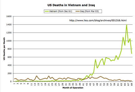
Here are the updated graphs of US war deaths in Iraq for April, with 76 US fatalities during the month.
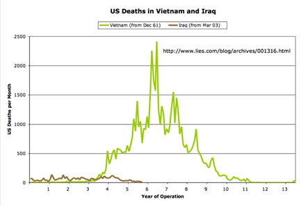
As always, I’m comparing the military casualties to those from the Vietnam war at a similar point in each war’s political lifetime (which some have charged is misleading; see disclaimer below). The data come from the advanced search tool at the Vietnam Veterans Memorial Fund site, and from Lunaville’s page on Iraq coalition casualties. The figures are for the number of US dead per month, without regard to whether the deaths were combat-related.
The first graph shows the first 38 months of the comparison. (Click on any image for a larger version.)
Next, the chart that gives the US death toll for the entire Vietnam war:
Disclaimer: I’ve been accused of comparing apples to oranges in these graphs. For the record, here’s what I am not arguing:
- I’m not saying that Iraq is somehow deadlier per soldier-on-the-ground than Vietnam. For both wars, the number of fatalities in any given month tracks pretty closely with the number of troops deployed (along with the intensity of the combat operations being conducted). There are more troops in Iraq today than were in Vietnam during the “corresponding” parts of the graphs. Similarly, for later years in Vietnam, when the monthly death toll exceeded the current Iraq numbers, there were many more troops in place.
- I am not saying that Iraq is somehow “worse” than Vietnam. I include the first graph mainly because I wanted a zoomed-in view of the Iraq data. And I include the second graph, which shows the entire span of the Vietnam war, because I want to be clear about what the data show about overall death tolls — where any rational assessment would have to conclude that, at least so far, Iraq has been far less significant (at least in terms of US combat fatalities) than Vietnam.
I was just curious how the “death profile” of the two wars compared, and how those deaths played out in terms of their political impact inside the US. For that reason, I chose as the starting point for each graph the first fatality that a US president acknowledged (belatedly, in the case of the Vietnam graph, since US involvement in the war “began” under Kennedy, but the acknowledgement was made only later by Johnson) as having resulted from the war in question.
As ever, you are free to draw your own conclusions. And for that matter, you’re free to draw your own graphs, if you have a way of presenting the information that you believe would be better. In that case, feel free to post a comment with a URL to your own version. Thanks.


May 15th, 2006 at 12:27 pm
Only Rummy, who once said the Iraq war could last “six days, six weeks, I doubt six months” and waved off a Vietnam analogy by saying, “I don’t do quagmires,” can explain all this.