Three Years In
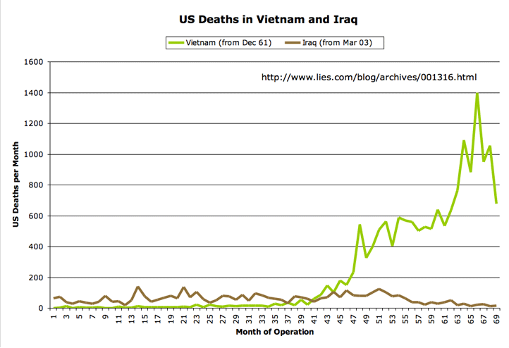
Here are the updated graphs of US war deaths in Iraq for February, with 55 US fatalities during the month. As always, I’m comparing the military casualties to those from the Vietnam war at a similar point in each war’s political lifetime (which some have charged is misleading; see disclaimer below).
The data come from the advanced search tool at the Vietnam Veterans Memorial Fund site, and from Lunaville’s page on Iraq coalition casualties. The figures are for the number of US dead per month, without regard to whether the deaths were combat-related.
The first graph shows the first 36 months of each war. (Click on any image for a larger version.)
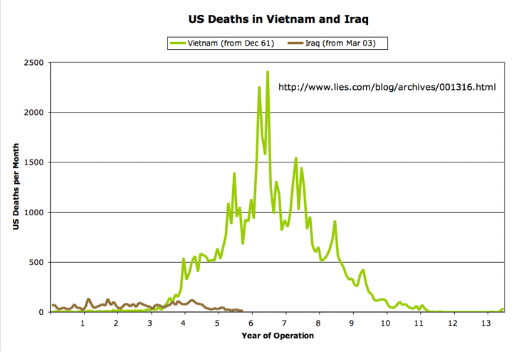
Next, the chart that gives the US death toll for the entire Vietnam war:
Disclaimer: Every so often someone comes along and says I’m guilty of intellectual dishonesty by comparing apples to oranges in these graphs. For the record, here’s what I am not arguing with these graphs:
- I’m not saying that Iraq is somehow deadlier per soldier-on-the-ground than Vietnam. For both wars, the number of fatalities in any given month tracks pretty closely with the number of troops deployed (along with the intensity of the combat operations being conducted). There are more troops in Iraq today than were in Vietnam during the “corresponding” parts of the graphs. Similarly, for later years in Vietnam, when the monthly death toll exceeded the current Iraq numbers, there were many more troops in place.
- I am not saying that Iraq is somehow “worse” than Vietnam, and have not chosen the starting dates for the respective graphs out of a desire to make a dishonest argument to that effect. I include the first graph mainly because I wanted a zoomed-in view of the Iraq data. And I include the second graph, which shows the entire span of the Vietnam war, because I want to be clear about what the data show about overall death tolls — where any rational assessment would have to conclude that, at least so far, Iraq has been far less significant (at least in terms of US combat fatalities) than Vietnam.
I was just curious how the “death profile” of the two wars compared, and how those deaths played out in terms of their political impact inside the US. For that reason, I chose as the starting point for each graph the first fatality that a US president acknowledged (belatedly, in the case of the Vietnam graph, since US involvement in the war “began” under Kennedy, but the acknowledgement was made only later by Johnson) as having resulted from the war in question.
As ever, you are free to draw your own conclusions. And for that matter, you’re free to draw your own graphs, if you have a way of presenting the information that you believe would be better. In that case, feel free to post a comment with a URL to your own version. Thanks.

March 23rd, 2006 at 8:48 am
Your website would seem to be well named.
What you say today:
“I am not saying that Iraq is somehow “worse” than Vietnam…I was just curious how the “death profile” of the two wars compared”
What you said the day you created the graph:
“I was watching John McCain and Bob Graham yacking at each other on Meet the Press yesterday, and good lord, this is sounding more like Vietnam all the time. It won’t be long before we’ll have politicians talking about “peace with honor” and secret plans to end the war.
And that reminded me of something I’d been meaning to do for a while. Whenever I bring up a Vietnam/Iraq comparison, fans of the current war point out that casualty rates in Vietnam were way beyond anything we’ve seen so far in Iraq. Which is true, if you’re talking about the Vietnam war at its peak. But there was a long run-up during which Vietnam simmered along at much lower casualty rates. I keep meaning to put together some charts to compare the two wars in terms of the US death toll, and now I’ve done that…It’s interesting to me how the Iraq war, so far at least, shows dramatically more US deaths per month than the Vietnam war did at a comparable point in its political lifetime…You can spin the data depicted in these charts however you like. For myself, I view them with concern. When politicians are allowed to launch wars for ill-defined reasons, with vague exit strategies and ever-shifting criteria for success, you have a formula for tragedy. That’s what happened back in the 1960s, and I can’t see any reason to believe it isn’t happening again today.”
I’ve analysised the dishonesty in the way you chose the start points of the war to death, and I see no reason to reiterate. Let me just point out some of the remaining half-truths you are using to cover your butt:
“For both wars, the number of fatalities in any given month tracks pretty closely with the number of troops deployed (along with the intensity of the combat operations being conducted).”
This is true, insofar that the number of fatalities in both wars is strongly correlated to the number of troops deployed, but it is in context a half truth. The reason is that the number of fatalities per 100,000 troops deployed is much lower in Iraq than in Vietnam. I don’t have the numbers handy, but I’ve heard numbers floated around from 1/3rd as lethal to 1/2 as lethal, and much lower than that if you remove from your calculation ‘theatre troops’ in both wars which were actually outside of the combat zone (in military parlance, the REMF’s, look it up).
“Similarly, for later years in Vietnam, when the monthly death toll exceeded the current Iraq numbers, there were many more troops in place.”
This is certainly true, in so much as at the peak of the Vietnam graph thier were some 600,000 troops in theater. But again, this is only a half truth in that it disguises that there is a point on the vietnam graph where the number of troops in place roughly corresponds to the number of troops in place in Iraq (100-150 thousand, depending on the period). That point is ‘fifth year’ of the Vietnam war as jbc defines it in his graph (though no historian defines it as such). Roughly from just before the 4 to just before the 5 on the graph (late 1964 to 1965), there were about the same number of troops in Vietnam as are now and have been in Iraq. What do you see? Well, you see that in Iraq, troop fatalities are averaging about 80 a month, were as in Vietnam they were somewhere above 400 per month.
Some posters have disengeniously claimed that that difference can be solely blamed on the improving US medical techniques. While the improving US medical techniques play some role, improving medical techniques mainly just shift deaths into the wounded category. And, the fact is that we could compare total casualties and find the same sort of striking difference. In Vietnam, in the period where the troop levels were comparable to thos e of Iraq, the military was taking some 3000 casualties (wounds and deaths) per month, compared to the 700 or so casualties per month be sustained in Iraq for about the same sized force. Now, its quite possible that a large portion of this difference could be explained by improved body armor and other technologies (though we have no real way of proving or disproving that) but that is not really proof of what those people want to argue either. It’s quite possible that had we 2006’s army in 1965 Vietnam that things would have gone better there too.
Very soon here, the graph will cross over the Gulf of Tonkin resolution – the point at which the Vietnam War becomes politically and militarily comparable to the war in Iraq – and apples will have to be compared to apples whether jbc likes it or not. When it does, my predictions will be born out – and indeed faster than I thought that they would be borne out. Soon, any month now, the molehill will meet the mountain and people who wanted to make mountains out of molehills – or at least predict the mountain based on the molehill – will have even more explaining and dissembling to do.
March 27th, 2006 at 8:34 am
So you are demanding answers and explainnations from graph makers?
How about holding your government accountable for the lies, mistakes and corruption that they have hurled upon you?
March 27th, 2006 at 8:57 am
shhhhhhh
must’nt disturb the Bush Delusion Syndrone zealots with anything so annoying like reality, incompetence, corruption, partisanship ahead of citizenship, ah heck I don’t have all day to enumerate the incredible failures and fuckups that define the Bush Regime.
Rightwingnutmoonbats: please list the great successes of the GWB Regime (crickets) anyone? (more crickets) anything at all? (crickets point out that the rethuglicans have done a pretty good job of dividing the country and gelding the Democrats… other than that? nada)
Have a nice day!