Esmay on US Deaths in Iraq
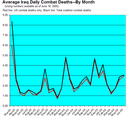
In honor of my recent Downing Street Memo obsession, let’s look at another case of facts being fixed around a policy. Pro-war weblogger Dean Esmay has created a graph that long-time readers of this site will immediately recognize: Iraq combat deaths: perspective. You should click through to the large version of the image on his site to get the full effect, including his observations on the significance of the various ups and downs, but here’s a cropped and slightly reduced version for the sake of discussion:
And here, for comparison purposes, is the most-recent version of my own graph of US combat deaths in Iraq:
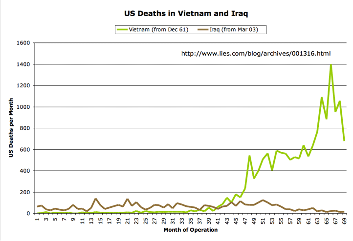
Esmay is using the same source for his data that I’ve been using for mine (the Iraq Coalition Casualties site), so it shouldn’t be surprising that the two graphs look similar. The one thing he’s doing differently with his numbers (besides avoiding my gratuitous comparison with Vietnam) is that he’s not plotting total deaths per calendar month, the way I am, but is instead giving a month-by-month daily average. (Oh, and he’s listing US and total coalition deaths as separate lines, while I do only US deaths; and he’s looking at combat deaths only, while I include non-combat fatalities. And he’s got that pretty blue background going on.)
Now, in one sense his use of a per-day average is misleading, in that it somewhat obscures the actual number of deaths involved. Glancing at his graph, you don’t see a monthly total of deaths ticking by (36, 52, 80…). Instead you see the less-alarming daily average (1.29, 1.73, 2.84…). And of course you could do the math yourself to figure out the actual number of deaths, but his labelling of the graph’s y axis makes those numbers just a tad less obvious.
The other thing that this choice of Esmay’s does is to let his graph emphasize the higher death rate in the very early days of the war. That’s because the March, 2003 numbers that make up both his and my first plotted data points actually only cover 11 days of fighting, from March 21 to March 31.
Those early days of the war were relatively deadly. On March 23, 2003, for example, 30 US troops died, most of them as part of the intense fighting that took place in and around Nasiriyah. March 2003 also saw some helicopter crashes with multiple fatalities, some friendly-fire and non-hostile vehicle accidents, and generally just a very large amount of shooting and bombing and mayhem.
What does Esmay make of this?
Note that in this first chart, ever since what was called “Major Combat Operations” (or what should probably more appropriately be called “The Invasion”), mortality has been much lower overall. We’ve never had a period as high in the number killed as the initial invasion, although we’ve had a few pretty bad days here and there.
I guess what he means is that, generally speaking, we haven’t had as many people dying in as short a period of time as we did during those first 11 days of the war. But it seems fairly silly to me to compare the first 11 days with monthly averages since then, in order to derive some hopeful observation about how mortality has been “trending” downward. We have to be sure to speak “generally,” too, since if we speak more specifically, there have been at least a few times when we’ve had short-term mortality rates higher than that of the initial invasion. For example, there was early May, 2004, when 79 US troops died in 10 days (7.9 deaths per day). Or early November, 2004, when 89 US troops died in 10 days (8.9 deaths per day). And in general, I think we’d have to recognize that the 1670 US deaths since the end of March, 2003, are fairly significant when compared to the 65 deaths that came before, even if the average daily death rate, when averaged on a per-month basis, has tended to be lower than it was during the war’s first 11 days.
What most of us really want to know, of course, is what the overall trend has been. Are we “making progress”? Is the insurgency in “its last throes”? Or are we thrashing along at pretty much the same rate of US deaths each month, or in fact seeing a slight increase over time?
Dean has this to say on that key question:
Overall, if you try to plot a trend over the entire period starting from day 1, you see a very mild upward curve, but that doesn’t really make sense. There was no organized resistance per se until several months after the initial invasion and the fall of Baghdad, and the mission of occupying forces is completely different from the mission of invading forces.
I find this passage really remarkable. The “very mild upward curve” Esmay sees is simply the objective reality that the US Iraq war death rate, over the entire course of the war, has been trending gradually upward. We’ve already seen how Esmay went out of his way to come up with an initial graph that gave him a high first data point on which to hang his preferred interpretation (that the overall trend is downward), but now, when he actually tries to fit a curve to the numbers, he realizes that it goes the other way. So what does he do? He simply rejects reality, because it “doesn’t really make sense.”
Hm. Maybe if he pokes and prods at the numbers some more, he can come up with a picture that looks more like what he wants. And indeed, that’s what he does next: he takes the four “periods” discussed by the Iraq Coalition Casualties web site (the initial invasion to the end of major combat, the end of major combat to the handover of sovereignty, the handover of sovereignty to the Iraqi elections, and the time since then), and plots the average daily death count for each period as a whole:
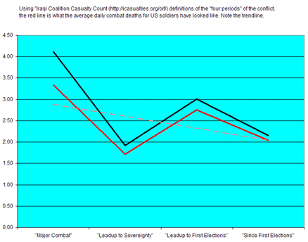
Now, this graph is really wacky, at least in the sense of providing any kind of apples-to-apples comparison. Note that we’re presenting four very different-sized chunks of time: The initial chunk covers about 2.3 months, the next one about 14 months, the next one about 7 months, and the last one about 4.7 months. This presentation completely obscures the overall death totals, since the periods across which the daily average is being computed can no longer be read from the graph.
But he gets what he’s really after: The downward “trend” (which again, he’s only able to get because he’s comparing the apples of the initial invasion to the oranges of the post-invasion occupation, over the course of which, even in this distorted presentation, you can see that the mortality is actually trending upward).
He concludes his analysis with the following:
My own gut tells me, frankly, that if by this time next summer the Iraqis do not have a new Constitution and have not held new elections that the formerly-privileged Sunni minority have participated in to a reasonable degree, it will probably be time to question whether the operation is ever going to succeed and start rethinking our strategy.
Until then, it seems obvious that we continue to retain the upper hand, and that the fascist insurgency is losing. Let’s hope that trend continues.
But as you can see, it’s really been his gut doing the talking all along. He ignores and massages the actual data as much as he needs to in order to make it support his a priori belief that we are, in fact, defeating the insurgency. But his own numbers clearly show that the insurgency has been getting stronger over time, rather than weaker (at least as measured by US deaths).
I’m reminded of the following graph by Dale Amon of Samizdata.net, which he hopefully presented under the headline “We are winning” back in October of 2003:
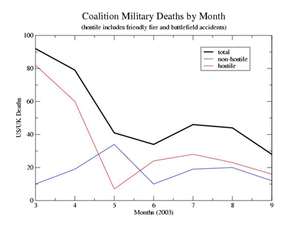
Amon was merely premature in deriving a negative trend from the insurgency’s slow start. I haven’t checked, but I doubt he’s updated that graph lately. Esmay, revisiting the same numbers today, needs to go to considerably greater lengths to find an upbeat message, but find it he does, in a nice example of how a hard-nosed, just-the-facts conservative (update: or not; see his response in the comments) can actually compete quite nicely with a mushy-headed liberal like me when it comes to ignoring data that conflicts with his worldview.
Update: As a sort of pretty-pictures-over-facts exclamation point, Esmay links at the end of his post to the following item from weblogger Chrenkoff: The willing. It features a nice collection of flags and soldiers in stirring martial poses, illustrating the “26 other countries… doing good work for the future of Iraq.” Yes, well, I wouldn’t want to call into question the individual courage of those 33 Macedonians and 26 Kazakhstanis, and the approximately 10 Norwegians currently in-theater are doing their part, I’m sure (amazingly, it looks like every single one of them managed to fit into Chrenkoff’s photo).
But if we’re going to talk about hard numbers, here’s the true picture: US forces currently account for about 87% of the foreign troops in Iraq. The next-largest contingent, from the UK, accounts for 5%. South Korea is 2%. The next three countries in descending order (Italy, Poland, and Ukraine) are 1.8%, 1.0%, and 0.8%, respectively — and all three of them are due to be gone before the end of the year. The manpower contributions of the other 20 countries in our grand coalition are significantly smaller than those. (See globalsecurity.org for details.)
I realize this leaves out the Iraqi forces we’ve been struggling to train and equip, and yes, I realize that they’re the ones we will eventually be handing this situation off to, one way or another, assuming any of them survive the insurgency’s targeted killings long enough for us to hand it off to them.
I’ve got nothing against giving all these brave soldiers their moment to pose, proud and unmaimed, under their country’s flag while someone snaps a photo. They deserve that.
Okay, we’ve now given them that. So let’s get back to talking realistically about what it’s going to take to get them out of this clusterfuck and back home.

June 25th, 2005 at 10:36 pm
Uhm, I did not “massage the data” or attempt to get any particular answer–and I find your accusation that I did really rather uncalled for. Our graphs are virtually identical because whether you calculate average deaths on a monthly basis or monthly total deaths you’re going to get the same basic result. Nor do I even see how “average of 3 deaths a day” is somehow less disturbing to anyone than “30 deaths in a month” since both numbers look the same to my eye. The point is to attempt to plot trends.
Furthermore, it is simply common sense to separate out the invasion force from the occupation force. And as for my “really whacky” graph–it is certainly not “apples and oranges,” it is based entirely on the four time periods clearly defined in the same Iraqi Coalition Casualties site. And it is a simple matter of fact that if you go by their site, and their own measurements as publish them, the number of combat deaths has NOT been going up. Simply go right to this page: http://icasualties.org/oif/ — and have a look. I did not define these periods, they did. And the numbers right on that site clearly show that the average daily death toll is down, not up. However, I didn’t jump on that because I think it’s too soon to assume that will still be the case, which is why I tried to plot an average between the four defined time periods and, while treating those separately, to see if a trend could emerge.
Your numbers would be more honest I think if you only counted combat deaths and not all deaths, since “all deaths” includes heart attacks, infections, falls, traffic accidents, and other such things. Otherwise I have no real problem with your charts at all. I merely note that they show the same thing as mine do, and the same thing the http://icasualties.org/oif/ site does–combat deaths aren’t going up.
Yes, the fascist insurgency that so many on the left sympathize with is growing more violent and more clever. They’re also being dealt with more and more by the Iraqis themselves. My own position on this is that by any rational or objective measure, the Iraq operation is already an incredible success, militarily speaking–and of course, a great and noble moral cause. This obviously may bias my interpretation, just as your own opposition to the cause may bias yours, but in no case did I intentionally skew any numbers or try to “massage” any data or pretty anything up.
Oh, by the way, I don’t consider myself a conservative. I get called one by folks like you simply because I support the liberation of Iraq. So even though I’m for national health insurance, medical marijuana, gay marriage, having government pay for people’s college educations, and so on, I’m supposedly a “right winger.” That’s just the nature of modern politics I guess, but oh well.
In any case it’s clear to me that both our analyses show the same thing: no discernible long-term trend in combat deaths except that it’s been down recently.
June 26th, 2005 at 12:12 pm
Regardless of our different perspectives, it’s an objective fact that US military deaths in Iraq have trended upward over the course of the occupation, rather than downward. That trend is especially obvious if you exclude the “major combat operations” phase from the analysis, which seems like an obvious thing to do if you’re trying to use the numbers to predict the future course of the occupation. But even including the major combat numbers, the overall trend is up, not down.
Now, you could argue that the trend is not statistically significant (I get a p-value of .08, though, which is going to make that argument a pretty difficult one). Or you could say that regardless of the trend in US deaths, there are other reasons to believe we are winning against the insurgency. But when you say that the trend in US deaths is actually downward, you’re wrong. The numbers don’t show that. They show the opposite.
“Massaging” might be too strong a term for what you’re doing; it implies that you’re misstating the evidence on purpose. I think it’s just as likely that you just aren’t very sophisticated about statistics and numerical analysis, and so are letting an unconcsious confirmation bias lead you to misinterpret what you see.
June 27th, 2005 at 7:39 am
Rawr! Hissss!
June 28th, 2005 at 7:37 am
All I know is that the violence in Iraq is escalating. The insurgents seem to be mounting more sophisticated attacks causing much more death and destruction. Because it’s mostly Iraqis dying in these attacks, we seem to not care as much.
But apparently, these means that the resisters are in their “last throes”, which according to Rumsfeld, may only last 12 years. Whew, I feel much better.
June 28th, 2005 at 12:35 pm
Rumsfeld’s 12-year prediction gets some interesting reactions from Iraq’s government and General George Casey, the US commander in Iraq, does his part to encourage the Iraqi security forces and the American public by explaining how weak the insurgents really are:
“This insurgency is not nearly as capable as everyone thinks it is. In fact, the insurgents want you to think they are more powerful than they are.”
Testing the George Casey theory, let’s take a look at Iraq by the numbers:
Number of U.S. troops in Iraq — 135,000;
Number of coalition troops in Iraq — 23,250;
Number of Iraqi security forces — 168,581;
Number of insurgents & militants — 16,000;
The cost of losing an insurgent (but not guerilla) war when your side has 326,831 soldiers and the other side has just 16,000: Priceless, er, um I mean $180,000,000,000.00.
June 28th, 2005 at 9:11 pm
It’s not that “we” don’t care so much if Iraqis innocents are dying in all these car/suicide bombings. It’s simply dependent on who caused their death. Day after day civilian men, women and children are being targeted and callously slaughtered by foreign and fellow Iraqi butchers. But “we” collectively shrug shoulders and say, “oh well, that’s just the way it is”. But let a mentally fatigued US soldier or some troops at a checkpoint make a mistake in judgement in what may be a split-second life-and-death decision, which results in civilian death, and watch the outrage and the anguished beating of chests in moral indignation over the senseless deaths of innocent people at the hands of a heartless military machine. The politically-motivated hypocrisy regarding civilian deaths is enough to choke on.
It’s obviously a very sore subject with me and I would do better to avoid addressing it. But its hard to let it go when I see comments that mischaracterize the reasons why “we” turn an uncritical eye to certain cilivian deaths.
June 28th, 2005 at 9:51 pm
Dean loves to call himself a “liberal,” based on some sort of 1850s definition of the word. I wonder why he runs away from “conservative” so fast.
He also often trots out his purported support of marriage rights for gay people as evidence of his liberal cred. Heh. If his support of the Iraq war were as soft and mushy as his support for gay marriage, he would have called himself a fascist terrorist-lover on his own site ages ago. Mostly he’s fond of writing about the “backlash” against gay people over this issue, and how the idea of two men getting married is “unprecedented in human history.” Oh, and then there’s the whole “AIDS is caused by AIDS drugs and poppers” thing. Let’s just say he won’t be speaking at any PFLAG meetings in the near future.
July 7th, 2005 at 9:50 am
Actually Craig, they are also dying from bombs dropping from US warplanes, “coalition” gunfire as well as car bombs. Lets not forget either, nonbody was dying in Iraq before the invasion. Iraq was not a terroist haven until Bush’s actions made it so.
Would London have been bombed this morning if the Iraq war was never started? What if everyone had just focused on hunting Al-Qaeda, you remember them, the people who attacked the US? What was that guy’s name again? Is he still out there? How long has it been? Any closer to him yet?
July 8th, 2005 at 12:49 pm
Amon hasn’t updated the graph since his original post but I’ve been posting the lies.com url for each month’s update in the comments to the post. So anyone can “test” his theory with the most recent information.
Here, in the comment immediately above, Rise Against says, “Let’s not forget either, nonbody was dying in Iraq before the invasion.” Hello! Lots of people were dying, and I don’t mean of natural causes. Saddam Hussein was a vicious dictator who held onto power by any means necessary. There were lots of political prisoners, with the associated tortures and killings. Because of the embargo and oil-for-food program, most people were dependent on the government to avoid starvation. The government did its best to see that food went to government supporters and not to those who couldn’t be counted on.
Saying no one was dying in Iraq before the invasion is as stupid as saying that no one is dying in Darfur today.