The Silk-Purse President
As you may have figured out by now, I’m big on the subjective nature of reality. But in spite of that, or maybe because of that, I’m a sucker for objective data. Like those graphs of presidential polling data from Professor Pollkatz that have been making the rounds lately; I love those things.
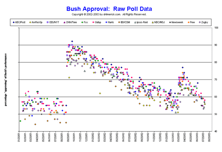
Here’s one of them (you can click on it to view the full-sized version):
This plots Bush’s approval rating over the course of his presidency so far, as recorded by 13 different public opinion polls. He starts off between 50% and 60% approval, and over the next nine months holds pretty steady, or perhaps suffers a very gradual decline. Then, on 9/11, an extraordinary thing happens: overnight, he gets a 35% boost in his approval rating.
Think what this means: In a single day, 100 million people changed their minds about Bush’s performance as president. Before 9/11, they didn’t approve of him. After it, they did. But Bush himself hadn’t actually done anything. It was all about our shifted frame of reference. As we closed ranks in response to the outside threat, we needed symbols to rally around: the flag, the president. He was our man, and we supported him. We needed him to succeed, so we adjusted the curve to make sure he got a passing grade.
Immediately, though, a steady decline in his approval set in. Absent a unifying event like 9/11, each day brought a steady erosion of Bush’s support, as more and more people decided that no, he actually wasn’t doing that good a job after all. Only now the decline was faster than it had been during the first nine months; the downward slope of the graph was steeper.
Then, recently, there was another uptick: The end of major hostilities in Iraq, and the Top Gun photo op on the Abraham Lincoln. But again, in the wake of that, the downward trend has reasserted itself, and again, the downward slope has steepened.
(Note, though, that Bush’s initial base of support remains intact. Even with the long slide since 9/11 and the steeper slide since the carrier landing, he still hasn’t dropped below 50%.)
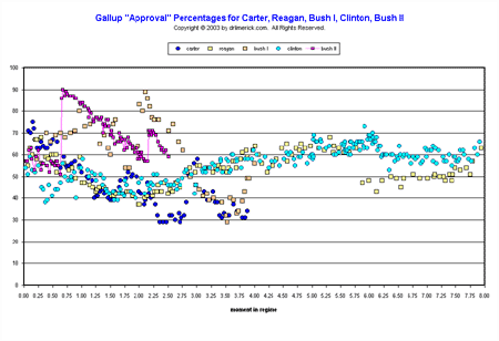
Now check out another Pollkatz graph. It keeps Bush’s Gallup-poll results, drops the other 12 polls, and adds Gallup polls for four other recent presidents, aligned to let you compare each president’s approval at similar points during his time in office:
Bush is the row of magenta dots; his dad is the nearly parallel row of steeply-declining yellowish dots during his own post-war period; like father like son. Carter is the dark blue; you can see how he and the elder Bush joined up with each other down around 30% approval as they closed out their one-term presidencies.
One thing I found fascinating about this graph is the eery parallel in the plots for Clinton and Reagan. Clinton is the light blue; Reagan is the yellow (unfortunately hard to distinguish from Bush I at this scale, though in the larger version it’s clearer). Each had declines early on (Clinton with an early downward spike during his healthcare and gays-in-the-military missteps), but then got on track and had a remarkably similar march through gradually increasing approval up to year six. Then they diverge somewhat; Reagan’s Iran-Contra revelations and Reykjavik-summit stumbles cost him somewhat more than Clinton’s problems with his penis, but both finished their terms back alongside each other.
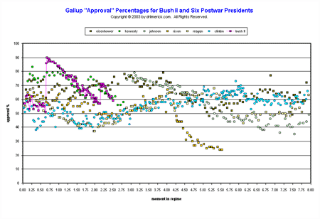
Here’s one more graph:
This one compares Bush with a slightly different set of post-WWII presidents; we’ve dropped Bush I and Carter, and added Ike, JFK, LBJ, and Nixon. The most dramatic thing here is the flameout of Nixon in the year before his resignation; he’s that row of yellow dots that dangles down in the middle of the graph before abruptly terminating at year 5.5. Even at the end, though, a quarter of the country still supported him: for them, at least, it was my president, right or wrong.
One other interesting comparison struck me when looking at this graph. Under normal circumstances, the only direction Bush’s support has ever gone is down. Clinton, Reagan, Eisenhower, and the pre-Watergate Nixon were all able to put together steady runs spanning at least a few years during which their support gradually built over time. So far, Bush has been unable to do that. In that respect, he looks a lot like Lyndon Johnson, represented here by the string of blue-gray dots that starts off with 80% support at year 3.0, then gradually sinks through the rest of his presidency.
With Johnson, as with Bush after 9/11, approval was bestowed rather than earned; the gift of a grieving nation rallying behind the president in a time of crisis. The public made do with what it had, turning a sow’s ear into a silk purse. But in each case, the man’s day-to-day performance could not sustain that popularity.


September 21st, 2003 at 7:04 pm
when was the first poll done and what questions were asked? what area were the people who took part in the polls chosen from? who paid for the poll and why was it done? how many peopple were interviewed in the poll? thanx i need it for a school project!!
September 21st, 2003 at 7:08 pm
Sorry for not making it clearer. Go to this page; this is Prof. Pollkatz’s site, and he’s the one who created these graphs from various people’s poll data. If you can’t figure it out from the information there, maybe you can email him for more specifics. Good luck!
http://www.pollkatz.homestead.com/files/pollkatzcontentpage.html